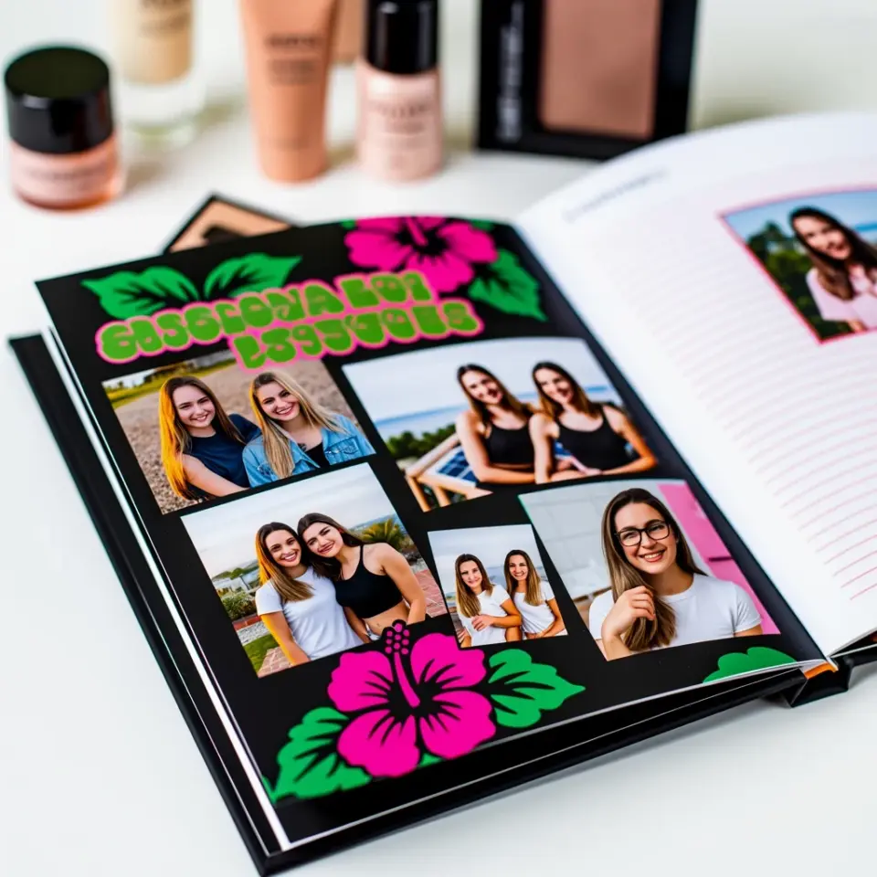
Simple Stacking with Cardstock Scraps
Let be honest here, most of us have a box (or three) of leftover cardstock pieces. Those scraps are gold for paper layering. Instead of tossing them, I use them as the foundation for dimension. Pick three coordinating colors from your stash, cut them into rectangles or squares slightly smaller than your base paper, and stack them offset by about 1/8 inch each. This gives you an instant matted look without needing to buy anything new.
I love that this technique uses up scraps and adds depth without making your layout feel like a brick. No foam adhesive needed here, just standard tape runner or glue stick. The key is keeping the offset consistent so the layers look intentional, not sloppy. Try it behind a photo or a journal card, you will see how a few cents worth of scraps can transform a flat page into something with real presence.
Foam Adhesive for Controlled Lift
If you want true dimension without bulk, foam adhesive is your best friend. I reach for 3D foam squares or thin foam strips when I need a layer to pop just a little. The trick is not to overdo it. Use foam only on the top one or two layers, and keep the base layers flat with regular adhesive. This prevents your layout from becoming lumpy or difficult to store in a page protector.
For a clean, professional look, try this: cut a strip of patterned paper, attach it flat to your background, then add a smaller strip on top using foam adhesive. The shadow created by the lift adds subtle depth. I recommend the 1mm thick foam squares for most projects, they give enough lift to notice but not so much that your page looks like a popup book. And always press firmly for a few seconds to ensure a strong bond.
Tearing Edges for Texture and Softness
Not every layer needs a straight cut. Tearing paper edges is one of my favorite ways to add texture without any extra supplies. You can tear along the grain for a fuzzy edge or tear against it for a more jagged look. I like to tear old book pages, music sheets, or even kraft paper to create a vintage, organic feel underneath my photos.
To make tearing look deliberate, keep the tear lines roughly parallel. Use a bone folder to crease the paper lightly where you want to tear, that gives you more control. Then layer the torn piece slightly overlapping another layer, and you get this beautiful handmade texture that no die cut machine can replicate. Perfect for nature themed layouts or beach vacation pages. Just be careful with thin papers, they tear easily, so work slowly.
Mixing Patterned Papers with Solid Cardstock
Patterned papers are beautiful but can overwhelm a layout if used alone. The trick is to pair them with solid cardstock layers to give the eye a place to rest. I start by choosing one busy patterned paper as my main element, then back it with a solid color that matches one of the tones in the pattern. That solid layer acts as a frame and creates separation, making the pattern stand out more.
For a three layer stack, I do: solid cardstock on bottom, then a lighter patterned paper in the middle, then a smaller piece of the main pattern on top. This creates a layered sandwich that adds dimension without any foam. I use this technique all the time for title blocks and photo mats. It is also a great way to use up those half sheets of patterned paper you never knew what to do with.
Spotlight Layers Behind Photos
Here is a technique that makes your photos the star: create a dedicated layer just for the photo spot. Cut a piece of cardstock slightly larger than your photo, then cut another piece about half an inch bigger than that. Stack them and attach flat. Then mount your photo on top with foam adhesive. This creates a spotlight effect, drawing the eye directly to the image.
I often use a neutral color like cream or light gray for the base layers so they dont compete with the photo colors. But if you want a pop, try a color pulled from the photo itself. For example, if your picture has a blue sky, use a pale blue cardstock for the middle layer. This subtle coordination makes the whole layout feel cohesive. Its a simple trick but it makes a big difference in professional appearance.
Using Washi Tape as a Thin Layer
Washi tape is not just for borders, it can act as a super thin paper layer that adds color and pattern without any bulk. I use it to create mini layers on corners of photos or along the edges of journal cards. Because washi is translucent, it lets the paper underneath show through slightly, giving a layered look that feels airy and modern.
Try this: layer three strips of washi tape side by side, each slightly overlapping the next, to create a striped block. Then mount a smaller element on top. The tape adds dimension through color contrast rather than physical lift. It is also a lifesaver when you need to cover a mistake, just layer a piece of washi over the oops and call it a design choice. I always keep a few neutral washi rolls in my kit for this purpose.
Putting It All Together for a Clean Layout
Once you have practiced these individual techniques, combine
#scrapbookingtechniques #paperlayering #scrapbooklayout #diycrafts #memorykeeping
Leave a Comment